In the chapters titled Concrete Objects and Concrete Structures in Christian Leborgs book Visual Grammar, he discusses the things that make a form concrete. These are objects defined by limits, so something that has fully closed structure that creates a contour for the eye to follow. With concrete structure, it involves concrete objects but in a more enclosed and defined space. A visible structure is one you can see, whereas an active structure is more implied. These type of objects are seen most often in patterns, logos, and symbols. Although they are the most basic structures in the visual world, they are vital to our storytelling in design. It’s much different from say a blob of paint on a piece of paper because they are highly defined and recognizable.
Something to also take into consideration is the size and scale of the object. Size and scale also play a role in this as they are relative to the person perceiving the object. Playing around with these two components can have a great effect on what you are trying to communicate, so it’s important to understand what it is you want to viewer to be perceiving and how to adjust accordingly. Something you create in illustrator may seem a lot bigger on your screen compared to when it gets printed for lets say a magazine design, so it’s good to always be checking on those sorts of things and testing the waters.
One of my favorite elements of design is color. The color of the object depends on the wavelength of light they are reflecting because that is just how color works. But it is up to the designer to be mindful when choosing colors and color palettes to be used in the design itself. Color can ultimately make or break what you are communicating within a piece. Choosing reds and warm tones for a food ad will evoke hunger to the viewer, whereas using blues and cool tones in the same context might do just the opposite. Conducting studies and using other means of research are vital when determining this.
Lastly, something to consider to bring depth to your objects is texture. Texture can help to evoke certain feelings from a piece and can range anywhere from geometric to completely organic. For example, if you wanted something to feel cozy you might add a fuzzy texture. Or if you want to give something an industrial feel you might add a shiny smooth texture. I think often times when people hear the word texture they immediately assume it is something rough or bumpy, when in fact it is simply the type of texture any given thing in the world has. It can be smooth, fuzzy, or even lumpy. Texture can make an immediate impact when used correctly.

This coke advertisement is a good example of using a closed structure as a graphic. There are no details or textures to it other than the brand name and yet we can still identify what that object is. This is an effective use of graphics.
https://www.quora.com/Will-seeing-Cokes-new-ad-make-people-want-to-drink-a-Coke-Why

This is another example of effective use of concrete objects. This design is entirely made up of enclosed shapes and still communicates to the viewer what it is without texture or a 3D component.
https://edu.gcfglobal.org/en/beginning-graphic-design/fundamentals-of-design/1/

This little cactus design is a great example of how pattern can be used as a texture. By doing this it adds depth and a sense of realness to an otherwise entirely illustrated piece.
https://edu.gcfglobal.org/en/beginning-graphic-design/fundamentals-of-design/1/
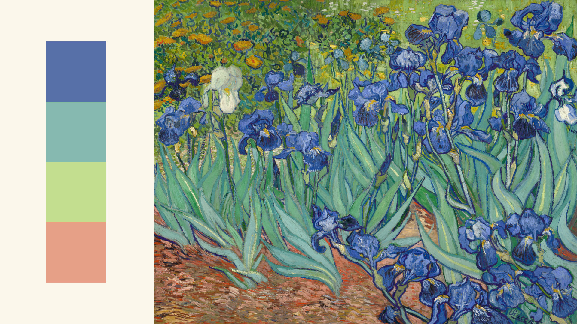
Here is an example of how to effectively make a color palette for something using Van Gogh’s painting. We can take inspiration from other works to better a current design.
https://edu.gcfglobal.org/en/beginning-graphic-design/fundamentals-of-design/1/
Book Credit:
Leborg, Christian. Visual Grammar. Princeton Architectural Press, 2006.
